How to create Neon Text Effect using HTML and CSS
Hello Friends,
Neon effect | How to create neon text effect using HTML and CSS | HTML and CSS neon effect | How to create neon effect in HTML | How to create Neon text effect using CSS
Today we will discuss about to create a Neon Text effect in your HTML or How to create Neon Text effect using HTML and CSS.
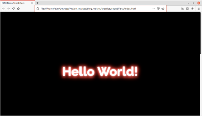
Neon is a basic and very attractive effect which is used in many places and its successfully catches eyes of users on it. Its a beautiful effect which can be more attractive on dark backgrounds. Check out the below screen shot:
So today we are going to make such kind of effect which is very simple to code. What you have to take attention is the shadow of the text. You have to play with some colors and shadows. That's it, even you can use the same in boxes images and much more. So lets get started.
So first of all here is our HTML and CSS document.
First you create a HTML document and add two div elements on it and insert two text with the tags here i used h1 tag and insert your text.
Create your CSS file and attached it with your HTML document using link element inside head tag of your HTML document.
HTML Code
<html>
<head>
<title>MTH Neon Text Effect</title>
<link rel="stylesheet" type="text/css" href="style.css">
</head>
<body>
<div class="text1">
<h1 class="neonText1">Hello World!</h1>
</div>
<div class="text2">
<h1 class="neonText2">NextGen Cafe</h1>
</div>
</body>
</html>
CSS Code
margin: 0;
padding: 0;
}
div{
width: 100%;
height: 768px;
display: flex;
flex-direction: column;
align-items: center;
justify-content: center;
}
.text1{
background-color: #000000;
}
.neonText1{
font-family: "Raleway";
font-size: 80px;
color: #fff;
text-align: center;
text-shadow: 0 0 5px #fff, 0 0 10px #fff, 0 0 15px #eb4034, 0 0 20px #eb4034, 0 0 25px #eb4034, 0 0 30px #eb4034, 0 0 35px #eb4034;
}
.text2{
background-image: url("wooden.jpg");
background-size: cover;
background-repeat: no-repeat;
background-color: rgb(0,0,0,.7);
background-blend-mode: overlay;
}
.neonText2{
font-family: "Dancing Script";
font-size: 150px;
color: #f6f6f6;
text-align: center;
text-shadow: 0 0 5px #fff, 0 0 10px #fff, 0 0 15px #b50940, 0 0 20px #b50940, 0 0 25px #b50940, 0 0 30px #b50940, 0 0 35px #b50940;
box-shadow: 0 0 5px #fff, 0 0 10px #fff, 0 0 15px #eb4034, 0 0 20px #eb4034, 0 0 25px #eb4034, 0 0 30px #eb4034, 0 0 35px #eb4034;
}
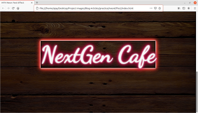
The Second result will be:
So by this u can also create beautiful neon effect on your text or borders just keep practice and comment your work.
You can check the live demo by clicking on below link:
https://glriihdzxu0ems6zqhc8tg-on.drv.tw/mthschools.tech/www.neonEffect.com/
Hope you enjoyed this article and we will get back to you with new interesting tips and tricks in next article till the time keep reading keep practicing because practice make you perfect.
Feel free to leave your valuable comments below.
Read Also:
- Introduction to R Technology
- How to create Card Flip Box using HTML and CSS
- How to Create Image Overlay Effect using HTML and CSS
Thank you


Nicely explained...
ReplyDeleteUseful share.
ReplyDeleteVery helpful and informative
ReplyDelete